Visualize Your Data Quality in SuiteCRM: A Guide to Assessing Data Accuracy
Enhance business insights and visualize your data quality in SuiteCRM. Learn to set criteria, verify data, and create reports efficiently.

Data quality is a recurring theme in projects, with reports available in SuiteCRM. Use them to help you visualize your data quality in SuiteCRM. Allow me to demonstrate how you can stay one step ahead by proactively identifying potential problems in your business processes, monitoring data patterns, and ensuring data quality.
Want to see it in action? I’ve got a video tutorial on how to check and visualize data accuracy in SuiteCRM. Whether you’re a CRM administrator, a data analyst, or just curious about maintaining data integrity, I’ll guide you through the process with valuable insights and practical tips.
Assuming your CRM system is all set up, and your business processes are in place, it’s important to make sure your data is spot on. Even with everything running smoothly, problems can still arise such as integration breakdowns. It’s very important to catch them early on. In this guide, I’ll focus on monitoring leads, assuming your lead generation forms are doing their job.
By the end of this guide, you’ll be equipped with the knowledge to identify potential issues in your business processes, ensuring that your lead generation forms maintain quality.
Let’s get started!
Define What You Want to See
Step 1: Define What You Want to See
Let’s kick things off by setting the criteria for what we want to monitor when checking out data quality.
In this demo, we’re putting the spotlight on the Leads module. When you have incoming leads, it’s assumed that your website or lead generation forms are working. However, once these quality leads enter your CRM system, that’s when the real business begins. Everything’s smooth and routine until something breaks – and that’s when we jump into action.
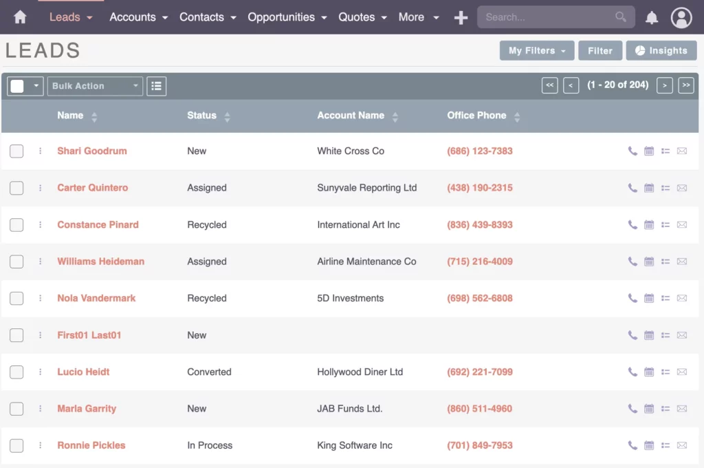
Now, let’s head over to the Leads module – where I can showcase the leads coming in. Our goal is to shine a light on these leads. Right now, we’re all about visualizing the daily lead count to spot any unusual happenings. For example, if you’re used to seeing around 10 new leads every day and suddenly, by noon, it’s zero – that’s a clear sign something’s up. It’s like an instant alert that calls for a speedy investigation and fixes.
To make this visualization magic happen, we turn to the Reports module where we create a new report.
If you’re not sure how to create a report yet, no worries – there’s a helpful video on SuiteCRM Report Basics you can check out. Additionally, check out the matching article: SuiteCRM Reporting 101: A Beginner’s Guide to Mastering the Report Basics
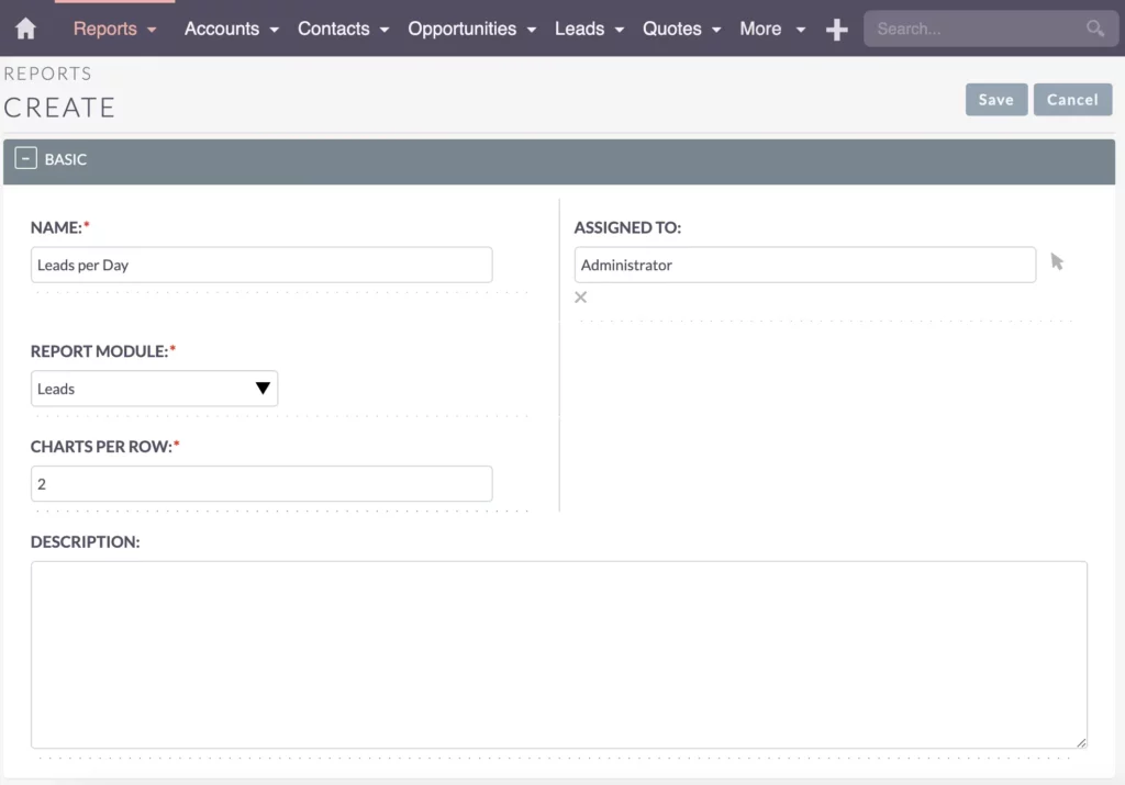
But for now, let’s focus on crafting a report specifically for the leads module to kickstart our data analysis.
- Name: Leads per Day
- Report Module: Leads
- Charts per row: 2
Check the Existing Data
Step 2: Check the Existing Data
Before jumping into creating reports and sorting things out, it’s crucial to ensure that your existing data is accurate and complete.
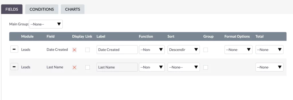
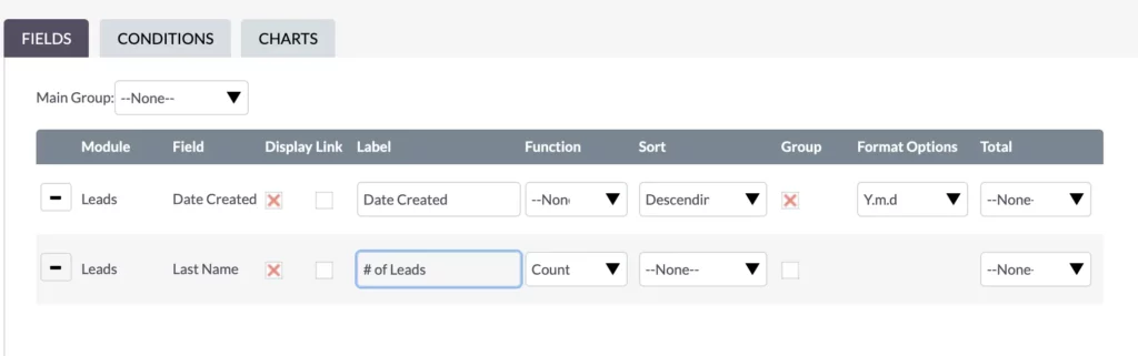
To start with something, let’s focus on arranging the data of your report by its Creation Date. I wanted to sort it in descending order so I could see the newest at the very top.
Now, head over to the Leads module in SuiteCRM and visually inspect the incoming leads. Double-check that the data aligns with your expectations, as this will serve as the foundation for accurate reporting.
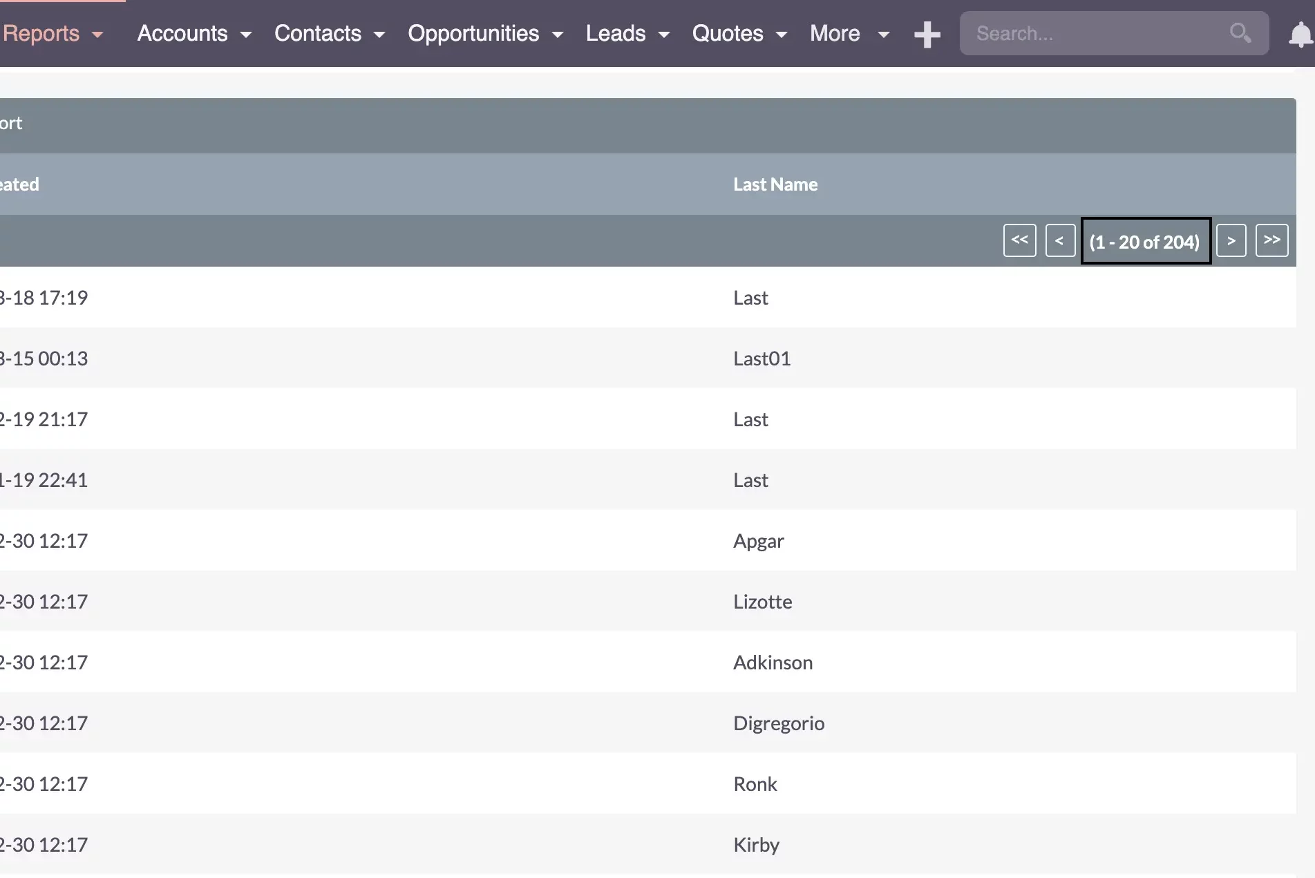
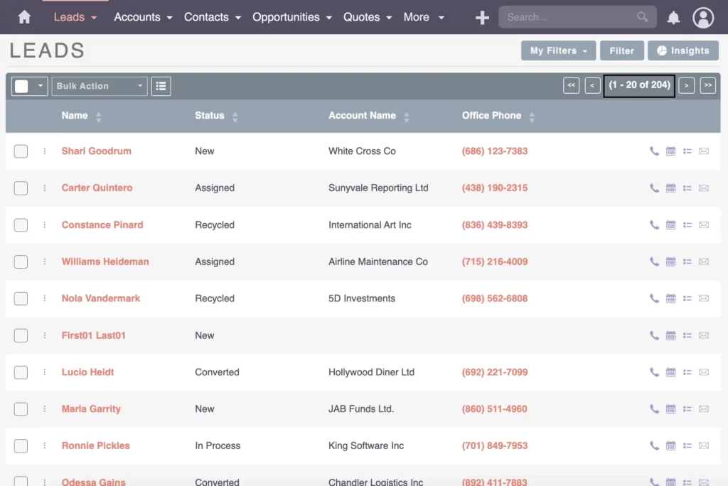
Taking a closer look at the numbers – everything seems in sync, showing that the filters are doing their job. The system is catching all the leads as it should, with no omissions or missing pieces. The flow of a few leads per day looks good, and the latest ones take the lead, indicating a smooth process.
Next up? Let’s group things together for a more organized view.
Build the Report
Step 3: Build the Report
Now that we’re crystal clear on what to monitor and you’re feeling good about your existing data, it’s time to build the report.
Head over to the Reports module in SuiteCRM. Here, we’ll focus on creating a report focusing on leads per day. Start by using the Date Created field to group and capture essential insights.
Grouping for Better Analysis
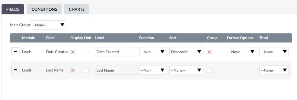
Moving on, the next step involves editing and grouping data.
When it comes to grouping, a challenge arises with the date-time format in the database, even down to seconds, making it impractical for meaningful analysis.
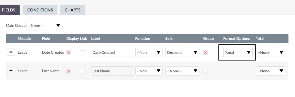
To make things more reasonable, you can change the date format, offering options like year-month-day (Y.m.d) and others. In our case, focusing on year, month, and day (Y.m.d) provides a clear daily view.
Counting Leads for Insight
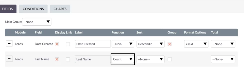
Now that we’ve got our data neatly arranged, it’s time to set up the count function. Just set the function of the Last Name field to Count. A simple count is all it takes for a quick analysis.
As we generate the reports, especially with growing data, it might take a bit more time to load them. For quick report generation, efficiency is crucial. Examining historical lead creation dates, we notice variations – sometimes a lot, sometimes just one or none. A keen eye is essential to spot anomalies, like a day with an unusually low amount of leads, signaling a potential issue.
Developing a sense of how the data should behave is crucial. Regular monitoring helps identify changes in patterns, providing insights into the system’s performance. Although outliers occur, the integration of website forms into the CRM system has remained intact.
Fine-Tuning Conditions for Precision
Let’s fine-tune conditions to focus on the last 30 days – a rolling time frame that keeps things fresh and accurate. Instead of just yesterday or last week, this approach adds a layer of precision to our analysis.
We get a better sense of how data should behave on any given month.
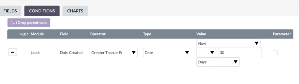
To make this happen, edit the Report and create a condition based on the creation date. Here’s how to customize it:
- Logic Module: Leads
- Field: Date Created
- Operator: Greater Than or Equal To
- Type: Date
- Value: Now – 30 days
After these adjustments, hit Save.
Voila! Now, your view is sleek, with just rows of data covering the last month.
Everything seems to behave correctly, with our processes and integrations moving seamlessly from website forms into the CRM system. Sure, there were a couple of outliers – like a day with only one new lead. But don’t fret; it could be just a slow day or a temporary glitch promptly addressed.

The key? Monitor your data regularly!
Develop a keen sense of how your data behaves in day-to-day or week-to-week scenarios. Any anomalies, especially sudden drops in leads, should trigger a closer look.
Bastian Hammer
This attentive approach ensures you grasp the usual ebb and flow of your data, contributing to proactive data management.
Enhancing Reports with Charts
Now that we’ve got our fields in order and conditions are all set, it’s time to introduce a chart for a visual breakdown.
Instead of a bar chart, I’m going for a line chart this time. This visual element adds a layer of simplicity, making it easier to grasp patterns and anomalies at a glance.
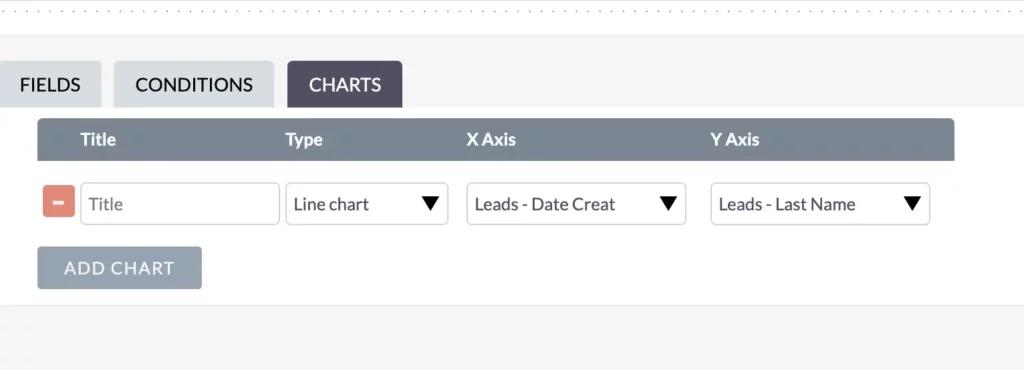
Time (Date Created) takes the x-axis, while the Count (Last Name) occupies the y-axis.
The chart’s effectiveness lies in its ability to quickly visualize any anomalies or patterns. Whether it’s the success of a webinar or a quiet day with no sign-ups, the visual representation gives you a sense of what’s happening. Quick, easy, and effective – just how I like it when monitoring and managing data effectively.
Customizing Report and Chart Labels
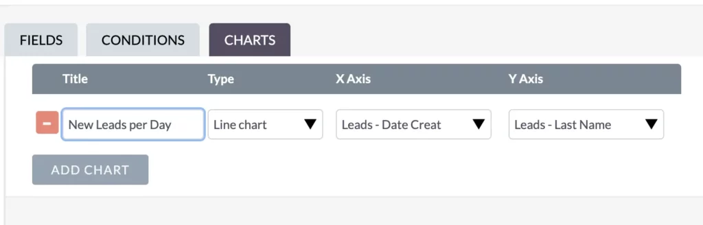
Now, it’s time to refine the chart labels for clarity and understanding.
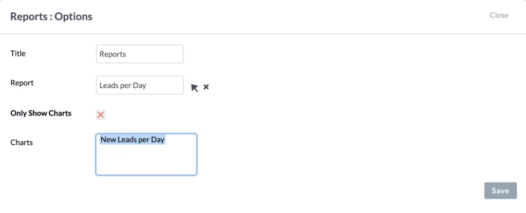
First, I ensure the “Date Created” label accurately represents the data. Then, I rename the “Last Name” to something that speaks volumes – how about “# of Leads”?
After making these tweaks, choose a fitting title for the chart – “New Leads per Day” sums it up nicely.
With the labels and title in place, the chart becomes a valuable tool for daily monitoring. By glancing at the chart regularly, it’s easier to assess how the day’s going. This proactive approach means we can quickly step in if anything seems off, keeping our operations smooth and our data in check.
Dashboard Report
Visualize your Data Quality in SuiteCRM: Add Reports to the Dashboard
To simplify daily oversight, let’s add the created report to the dashboard. This central spot makes it super easy for quick daily checks. The visual representation of leads per day over time enhances your ability to identify anomalies promptly.
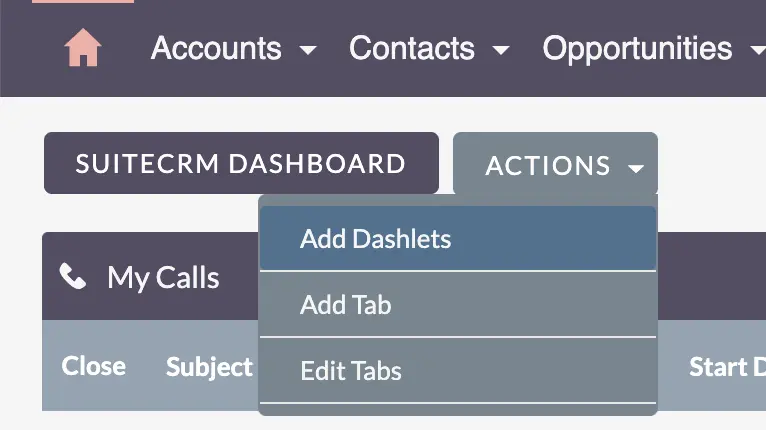
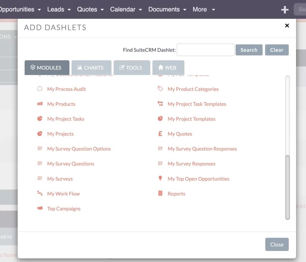
Here’s how to do it: Go to your dashboard, hit the ‘Actions’ dropdown, and Add a Dashlet.
Choose ‘Report,’ pick the ‘New Leads per Day’ report, and opt to display the chart for visual clarity.
After saving, your dashboard now features the chart, ready for monitoring alongside other key metrics.
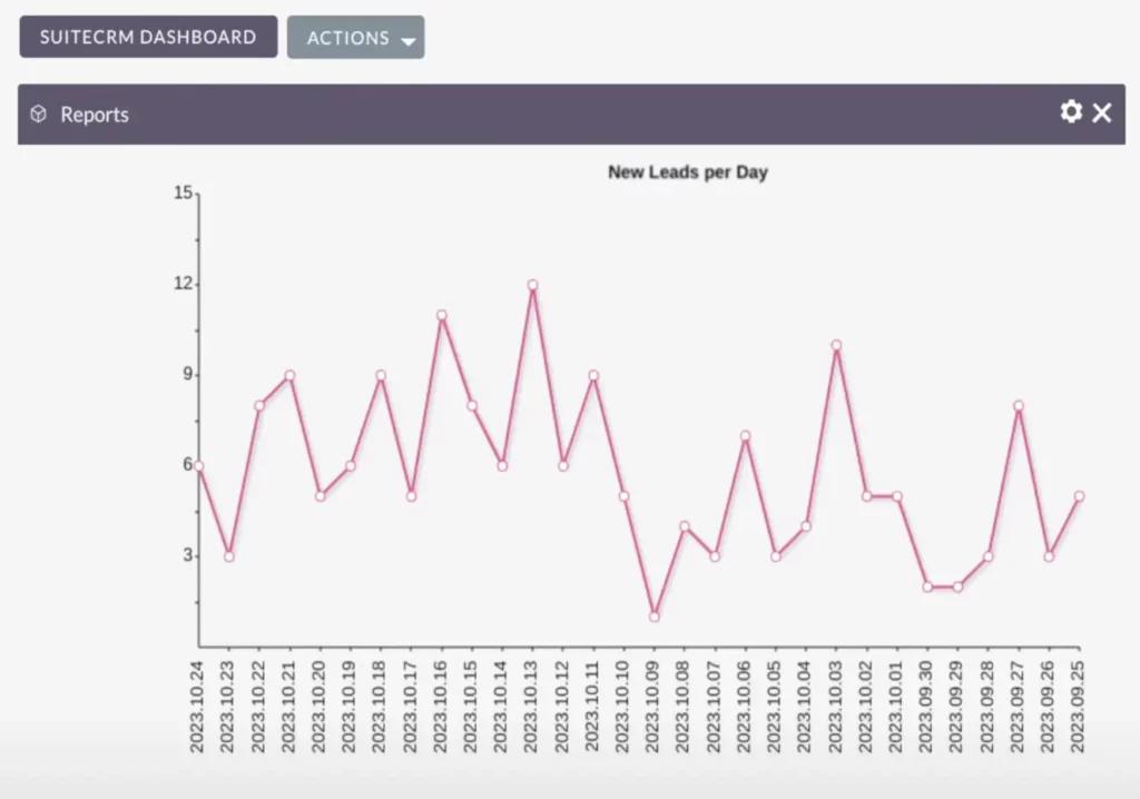
It not only makes things more accessible but also smoothens your daily routine. When you’re dealing with numbers, facts, and figures, visualizing data through charts is a quick and efficient way to make sure everything aligns with your expectations.
Recap
Visualize your Data Quality in SuiteCRM – Recap
Let’s sum it up real quick. When it comes to monitoring data quality, visualization is key.
Turn your data expectations into a report, then generate a chart from it for that extra clarity. By adding this chart to your dashboard, daily checks become effortless. Just skim through the chart to ensure consistent data trends without major outliers. This streamlined approach keeps your business operations on track.
Thank you for joining me in understanding why visualizing data quality is crucial. Regularly checking ensures your data matches what you expect for your business. Stay tuned for more insights in my next article. Until then, take care!